

Role
UX research
Wireframing
Prototyping
Visual design
Timeline
April 2023 (3 weeks)
Client
Design Interactive
Team Members
Keya Zambare
Randy Chang
Neha Bagepalli
Rooshni Dash
Context
The Schedule Builder platform at UC Davis is an essential element in registering for student courses. During the Fellowship, my primary focus was on user research, the design system, and the development of numerous prototypes. Given the nature of the design challenge we were involved in, the presentation of our final designs replaced A/B testing.
Problem Statement
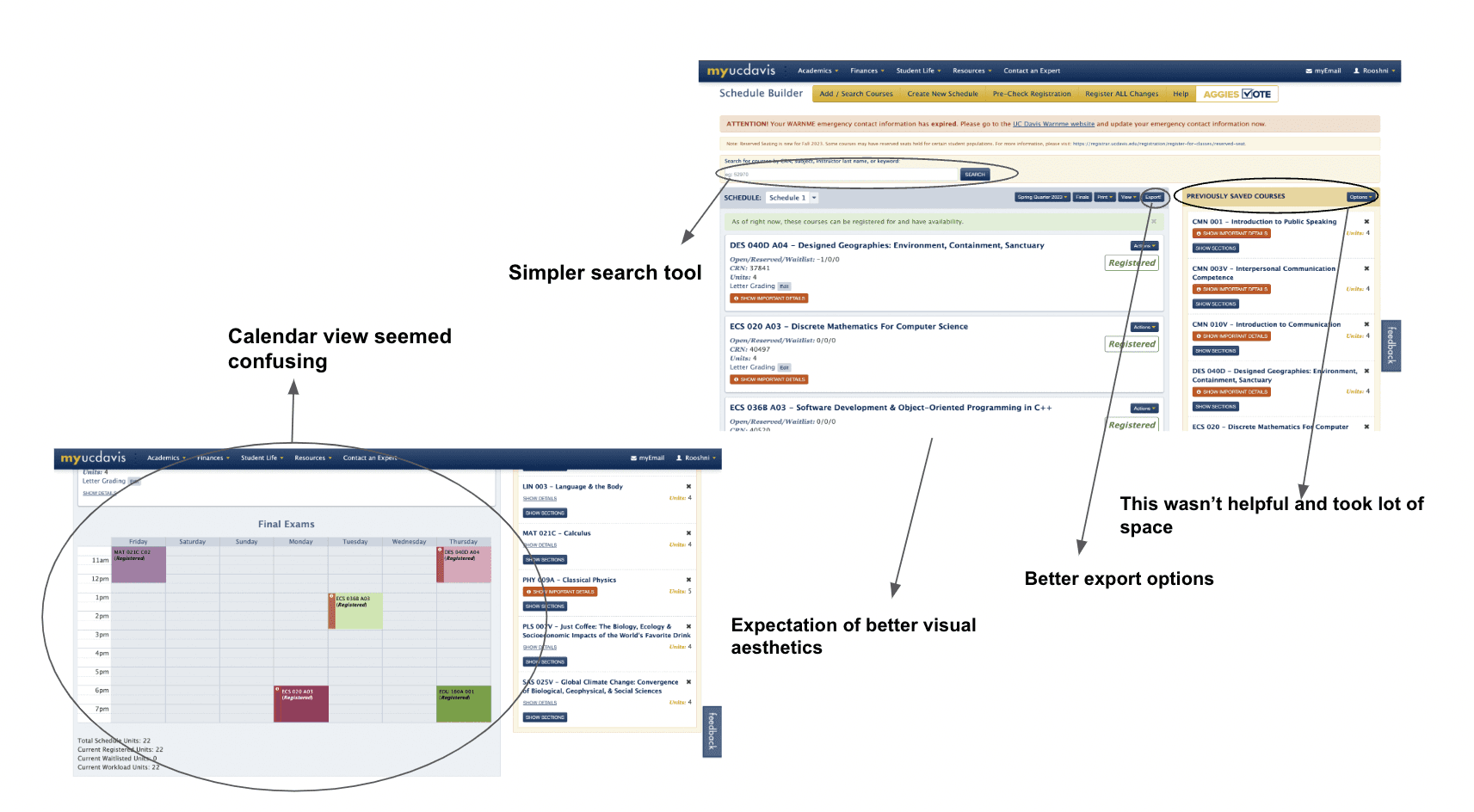
While Schedule Builder is an essential tool for UC Davis students, the registration period often induces stress due to interface challenges. Despite its functionality, the platform's dated aesthetics and navigation complexities presented opportunities for enhancement, particularly for new users unfamiliar with the system.
Key Research & Findings
Discovery Phase: We employed a mixed-methods research approach to gather comprehensive user insights:
Quantitative Analysis: Conducted user surveys focusing on interface satisfaction, Gathered metrics, Analyzed user navigation patterns (Google Survey)
Qualitative Research: Collected feedback on pain points and desired features, Documented user stories and scenarios (Affinity Diagram)

Survey Analysis
“Whoa, the Schedule Builder site looks so crammed and outdated. I mean, it gets the job done, but the interface feels like something from the 90s. Could use a major visual refresh to make it more modern and appealing, you know?”
“I'd love to see a sleeker, more intuitive design that makes the whole course registration process less of a headache.”
40%
of the users
of the users found navigation simple
Professional
56%
of the users
are freshman and sophomores
90%
of the users
rated aesthetics the lowest
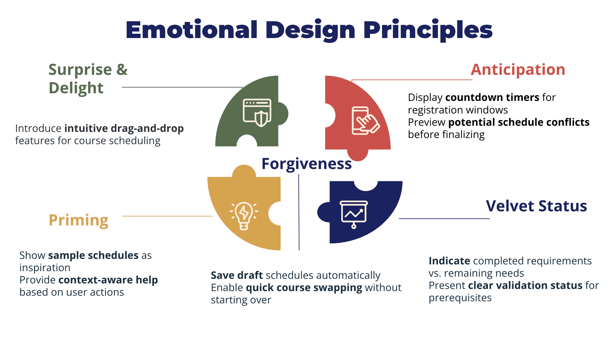
Design System
Information Architecture: Preserving successful navigation patterns, Streamlining the course selection workflow, Improving visual hierarchy for better information scanning
Visual Design: The redesign emphasized Contemporary color palette selection, Consistent typography hierarchy, Enhanced contrast for better accessibility, Clear visual feedback for user actions

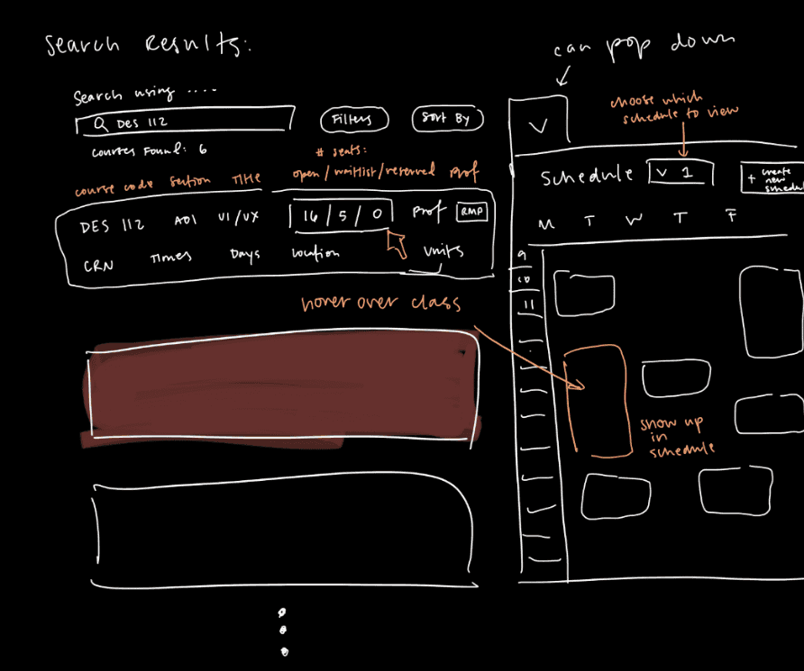
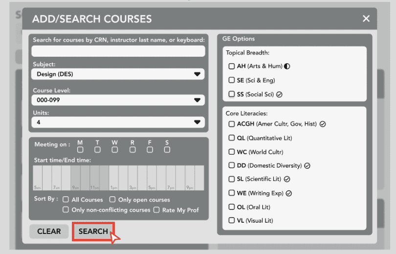
Sketches & Hi-Fi & Mid-Fi Designs


Layout
Home Page
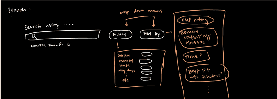
Search Bar

Main layout
Drop Down layout
Main Page
Enhanced readability and aesthetics with a better calendar view

Search courses
Added simultaneous calendar view along with the course search catalogue

Drop Down Section
Made the filter more defined and added small icons which shows the GEs completed/in progress
Key Takeaways + Next Steps
1.Redesign requirements + keeping in line with project’s focus
2.With more time:
Working to create more improvements
Focus on structure more
Develop further iterations of designs (more complex animations to convey how different components are connected)
Conduct more user testing to gather results on improved designs
View next 👇🏾👇🏾

swsh
Transformed image distribution for expert photographers via a primary dark-mode interface and touch-driven interactions. Pioneered market entry approaches, identity positioning, and customer acquisition drives, realizing a 30% rise in registrations.

Moober
Revamped an outdated corporate planner into a user-friendly drag-and-drop system, reducing task fulfillment durations by 60% and lifting satisfaction ratings from 6.2 to 8.9 out of 10. Concentrated on accessibility and consistent cross-platform performance.
Contact me
© Designed with love!